The Devil is Always in the Details
(continued)
Art Deco was one of the early architectural and artistic styles to express the world’s excitement about modernity, about a new age of speed experienced in ocean liners and airplanes, about the benefits that modern technology would bring to everyone. Art Deco left behind old fashioned Gothic or Colonial styles for a new look that would celebrate this future.
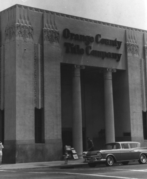
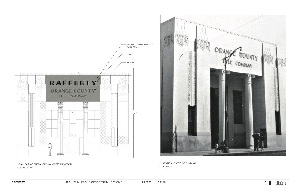
The original sign at Orange County Title reflected that. There was an easy, syncopated Jazz Age balance to the lettering that expressed Orange County’s hopeful look to the future and growth. Instead of an “R” where the upper loop and the lower legs were equal sizes, the sign’s Art Deco “R” made the loop larger on top to contrast with the smaller base of the legs it sits on. The same contrasting proportions, adding energy to the sign, is seen in the”P” and the “A.” That visual strategy is reversed for the “E,” where the proportions are switched; the middle bar of the “E” is raised to create a stronger visual energy.
Such details added the “oomph” that brought the original design alive.
The Santa Ana Planning Department has kept Preserve Orange County apprised of Toll Brother’s plans for this sign. We were concerned that their proposed design did not follow the Secretary of the Interior’s Standards for rehabilitating a historic building. Those standards, outlined by the Department of the Interior and the National Park Service, call for a faithful recreation of such lost details, as far as photographic or other evidence allowed.
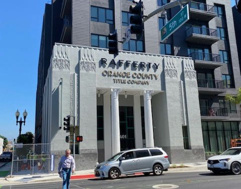
Toll Brothers’ initial drawings showed a blocky font which is commonly used in 2024 but was unknown in 1931. A new sign with the project’s name, “Rafferty” was set above it. Besides being historically inaccurate, the blocky, static lettering proposed by Toll Brothers would deflate the liveliness of the original sign and building — the visual vitality that a true restoration could bring to the streets of Santa Ana.
But Toll Brothers, in consultation with their historic consultant, Jennifer Mermilliod, revised their proposal. We met with them and the Planning Department on site in March to review their new design, which does reflect the original Art Deco character. The project’s name, “Rafferty,” will be above it, but in a different font style, and rear lit to create a halo effect. This, in keeping with the Secretary of the Interior’s Standards, is distinctly different from the original sign, helping people to distinguish what is historic and what is a contemporary addition.
For more information about Preserve Orange County’s advocacy effort to uncover the 1960s metal overlay, please go to our Watch List here.
By Alan Hess
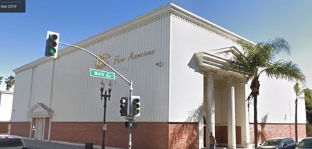
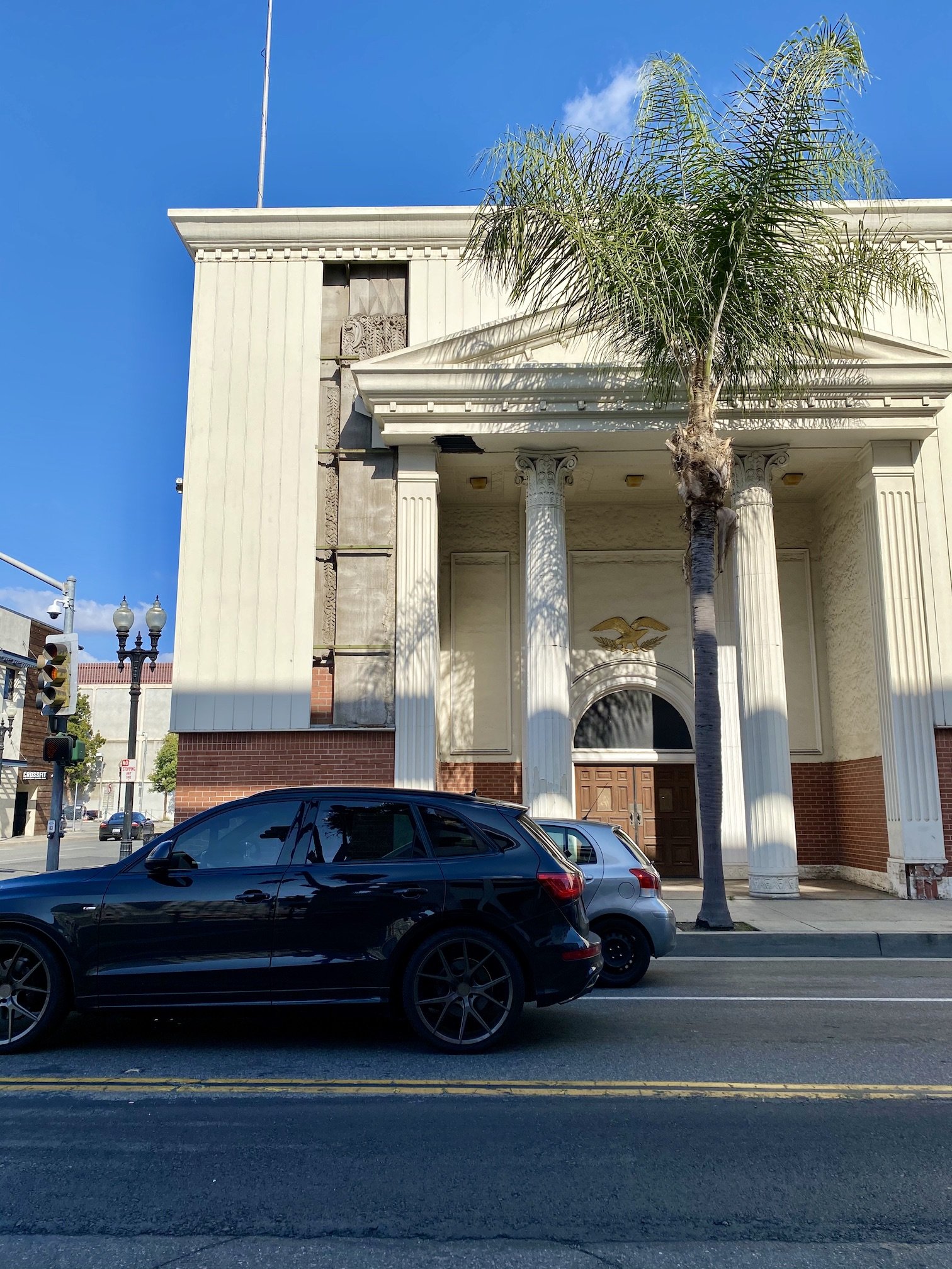
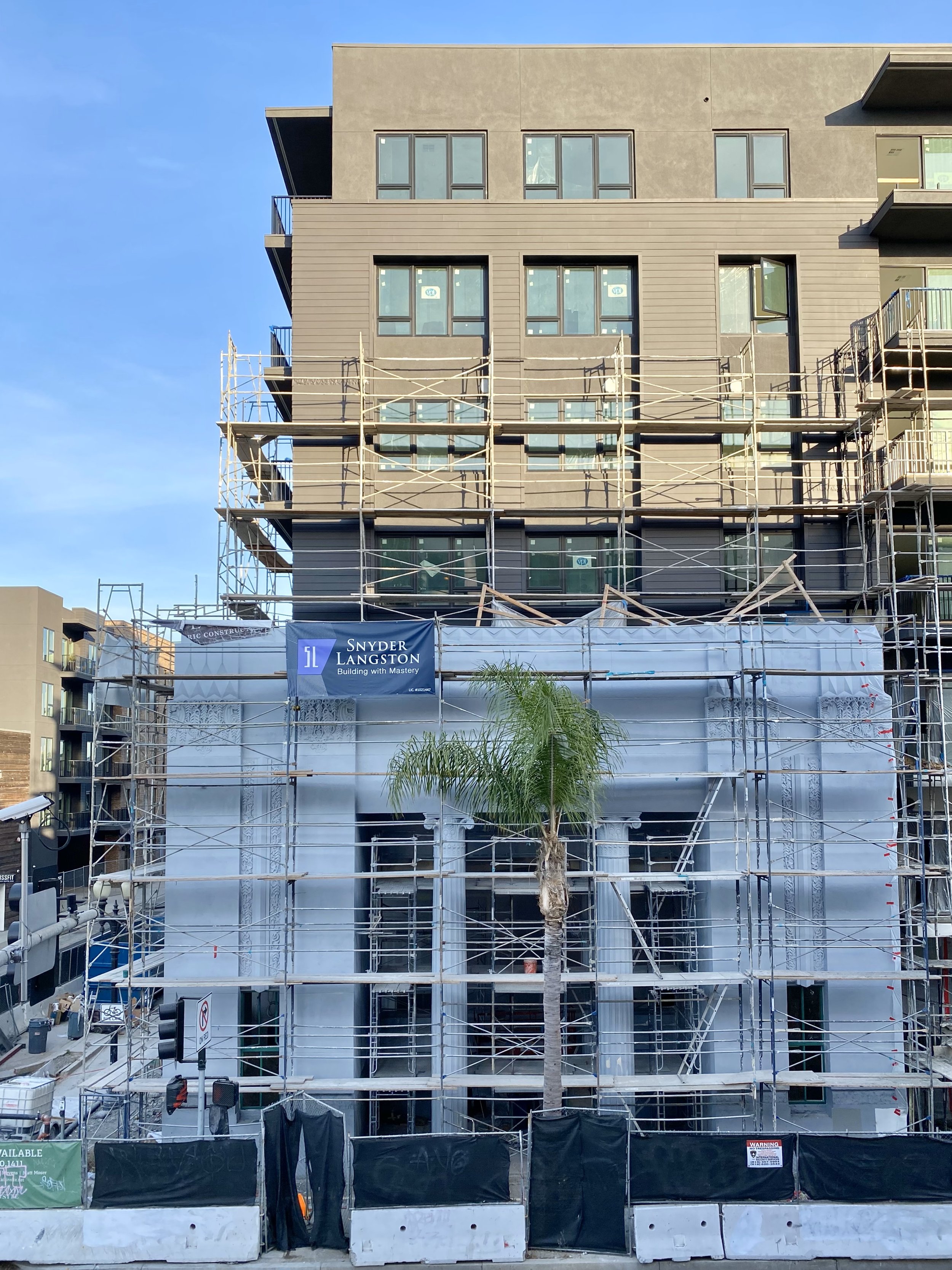
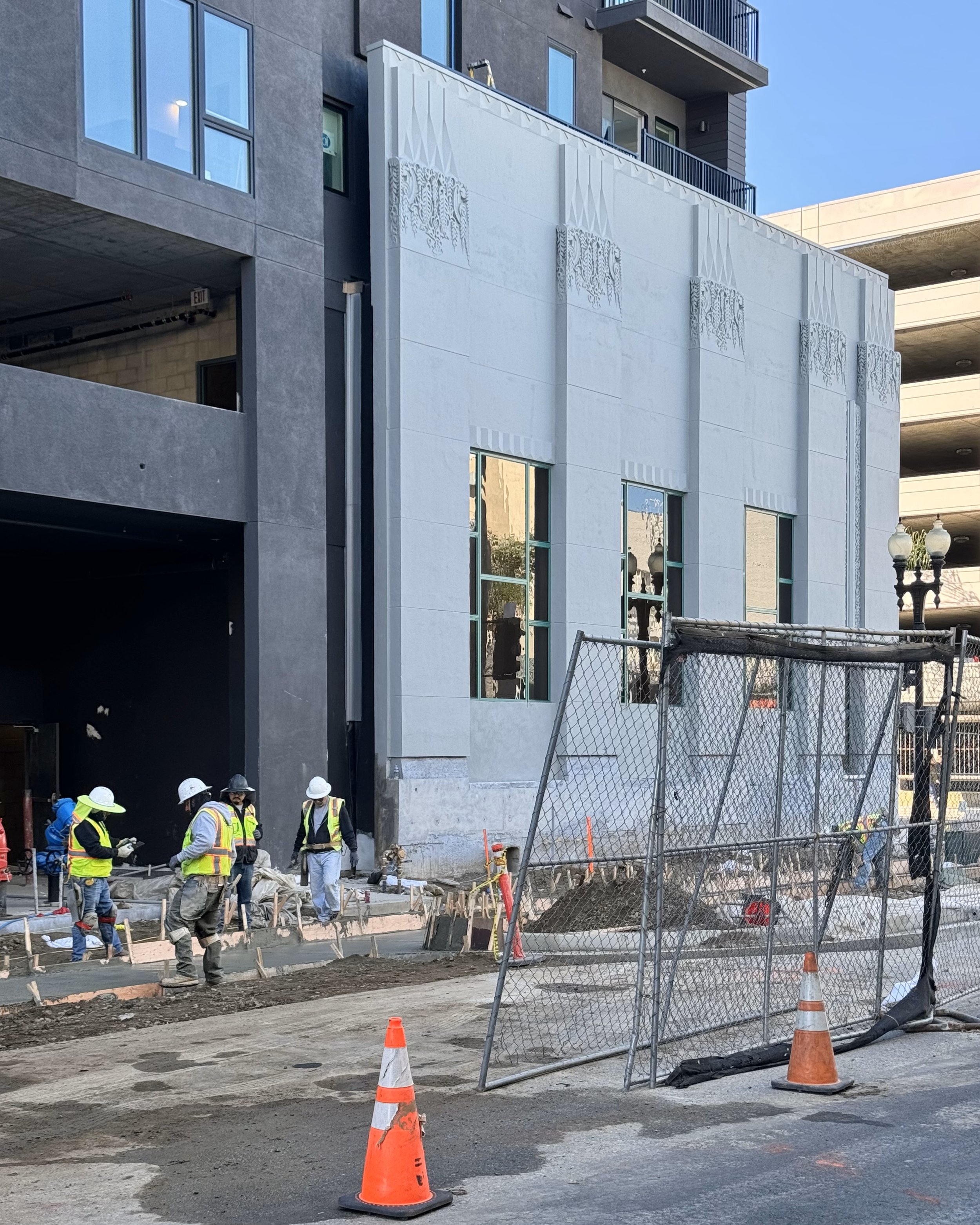
Photographs show the evolution of the 1931 building from its original function as the Orange County Title Company to the First American Title Company to today’s integration with the Rafferty development.

